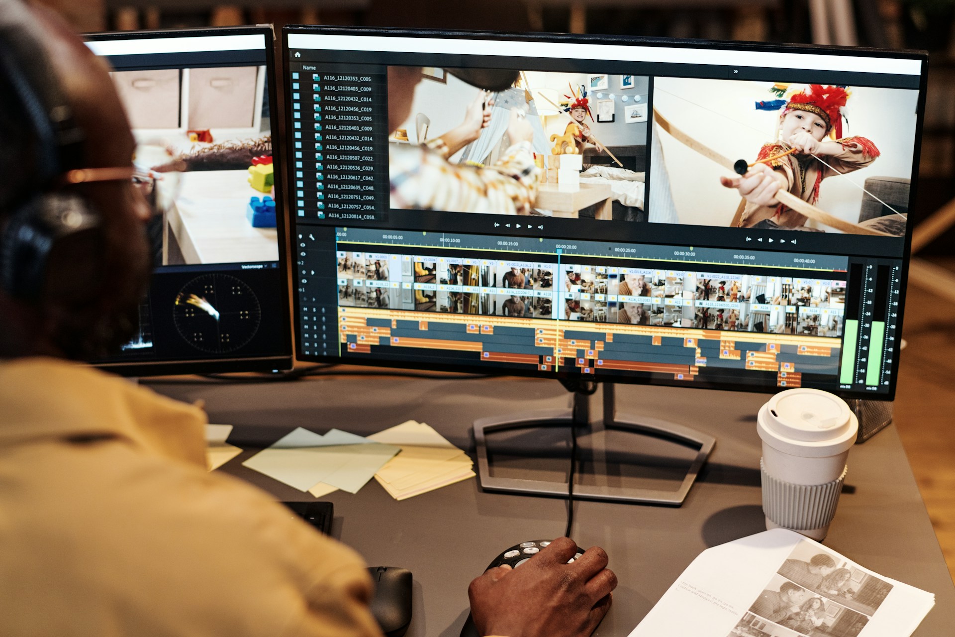
Have you ever struggled with creating a design that just doesn't look right, even though it's hard to say what's off? Graphic design plays an important role in how a brand communicates. It's not just about making things look nice. Effective design sends a message, guides the viewer's eye, and builds brand recognition. When things go wrong, however, it can confuse the message and affect how others view your brand.
Design mishaps can be frustrating, especially when you're putting in the effort. Layout problems, color choices, and image quality are common challenges that can disrupt even the best intentions. Understanding these issues can set the stage for better designs and help avoid wasting time and resources. Let's explore some common mistakes and how to fix them.
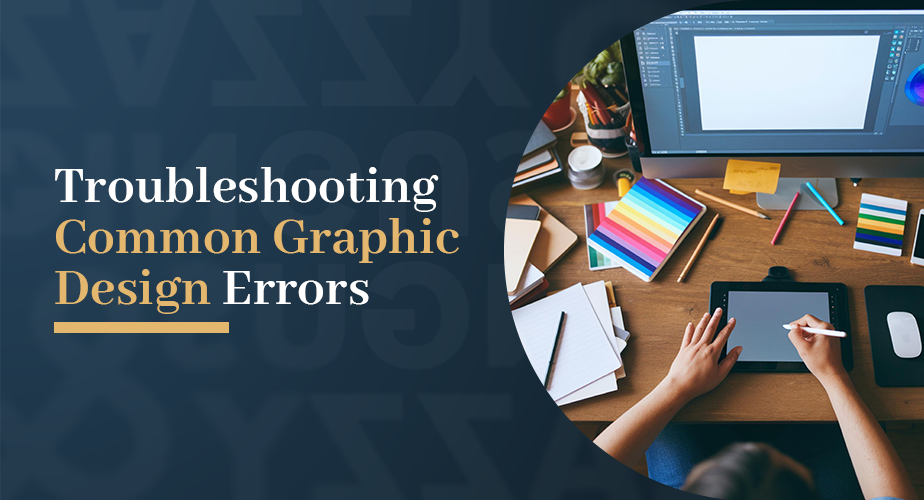
Identifying Frequent Graphic Design Mistakes
When it comes to graphic design, several mistakes often crop up, leading to designs that feel a little disjointed or unclear. One major error involves layout and composition. When design elements aren't aligned or spaced properly, it can create visual noise that confuses viewers rather than guiding them.
Another pitfall is misusing color schemes. Colors have the power to draw attention or even signal where to look next in a design. If colors are too similar or clash, it can hinder readability and create a disconnect from the brand message. Think about the confusion caused when the text is similar in tone to the background—everything blurs together, losing impact.
Unclear or pixelated images can reduce the overall quality of your design. Imagine trying to enjoy a beautiful landscape blurred by fog. A similar effect occurs with pixelated images—they detract from detail and professionalism. In each case, these missteps lead to a message that isn't as effective as it could be.
Practical Solutions for Layout and Composition Issues
Creating balanced and attractive layouts might feel overwhelming, but there are straightforward techniques to get it right. Start by using grids and templates to guide the placement of elements. Think of a grid as the skeleton of your design, giving structure without restricting creativity.
For effective alignment, consider these tips:
- Align images, text, and other elements so they form clear lines either horizontally or vertically.
- Use consistent spacing between items to create a sense of unity.
- Let elements breathe by maintaining appropriate margins around the edges and between content.
Consistency is key. Stick to a uniform style for fonts, shapes, and colors, and your design will look more cohesive. As you refine your layout, you'll find it easier to create designs that are both eye-catching and clear, ensuring each part of your message is communicated effectively.
Enhancing Color Schemes and Readability
Choosing the right colors for your design doesn't just make it look good; it can also make your message stand out. One handy trick is to pick complementary colors, those that sit opposite each other on the color wheel. This contrast helps important elements pop and guides viewers through your design effortlessly.
Contrast isn't only about color theory; it's also about readability. For text-heavy designs, make sure there's a good difference between the text and background colors. Dark text on a light background, or vice versa, is usually a safe bet. It's like how we naturally find it easier to read black text on white paper than on a grey one.
Colors can also communicate moods and ideas. For example, blue often feels calm and trustworthy, while red can feel exciting and urgent. Understanding these associations lets you harness color psychology effectively. The color choices should align with the brand's message. If you're aiming for a vibrant, friendly vibe, cheerful colors like orange and yellow might be ideal.
Improving Image Quality and Selection
Images can make or break the appeal of a design. To ensure your graphics enhance rather than detract, select high-quality imagery. Look for images that are sharp and clear, free from pixilation. They should also be relevant to the message and resonate with your audience.
Optimize images for different formats by considering where they'll be used—whether for a website, print, or social media. Different platforms have varying size requirements, and sticking to these preserves image resolution and loads them faster. For instance, using a too-large image on a webpage can slow down load times, potentially causing visitors to lose interest quickly.
Effective imagery shouldn't just look great; it should hold meaning. A well-chosen picture can connect with viewers emotionally and convey complex ideas instantly without words. This depth adds another layer to your design, making it not just visually appealing but also meaningful.
Taking Control of Your Graphic Design with Professional Help
Sometimes, getting the design just right might feel overwhelming. This is where professional graphic design services come in handy. They have the skills to tackle common pitfalls, elevating your brand's image without the usual headaches.
With the right expertise, professionals ensure every element aligns with your brand's message. They can save you time and effort by providing polished designs straight away and minimizing the constant trial and error typically experienced by those without design training.
Investing in professional help means your designs will consistently reflect the quality and effectiveness your brand stands for. It provides peace of mind knowing your brand communication is in capable hands, allowing you to focus more on growing your business and connecting with your audience naturally.
Wrapping up a successful design project often requires the right team and expertise to overcome common challenges. If you're looking to elevate your brand through expert design solutions, consider working with a trusted graphic design services company. Explore how Dingus & Zazzy can help transform your visual communications with designs that truly reflect your brand.