Design can be a lot of fun when ideas start flowing and creative work kicks into gear. But without direction, even the best intentions can fall flat. Projects that start with energy sometimes lose their way when there’s no clear goal, and that usually shows up in the finished visuals.
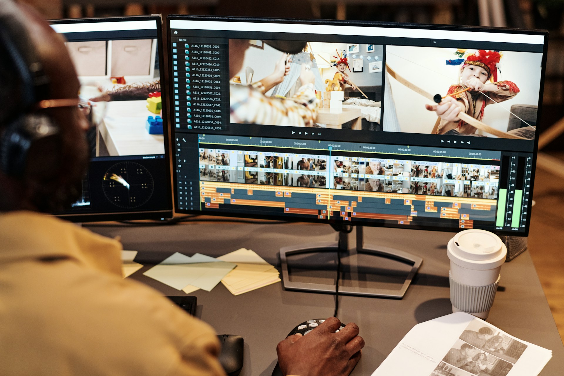
Online graphics design looks simple enough from the outside. You pick a tool, drop in your info, and get something shiny out. But with no plan in place, small choices can snowball into a look that doesn’t match your brand or message. As we get ready to turn the calendar, it’s a smart time to look at how design direction helps make everything work better, especially when deadlines get tight.
Design isn’t just about making things look pretty. At its core, it’s a way of showing who you are and what you offer, without having to say a word. When a business takes a little extra time to set direction for its visuals, it often pays off in more ways than you might expect. Clients feel more comfortable, teams work better together, and the brand as a whole starts to stick in people’s minds.
What Happens Without a Clear Plan
Without some structure, online graphics can slide off course in a hurry. That’s when little gaps start popping up between what you want to say and how things actually look.
• Designs may come out looking mismatched, with different colours, fonts, or layouts from one graphic to the next. This can make your content feel scattered or inconsistent.
• When more than one person works on design tasks without shared rules, it’s easy to end up with mixed signals. One post might be playful, while the next one is stiff and serious.
• Last-minute fixes and rushed edits become a regular thing, which leads to stress and small errors that are easy to spot. Spelling slips, awkward cropping, or odd formatting can leave a rough first impression.
When design doesn’t have a plan behind it, people start guessing. And that’s usually when confusion and rework starts creeping in.
Another thing that tends to happen is that feedback becomes harder to give and receive. Without clear direction, everyone is working off their own ideas of what looks good or what the brand should say. This can make creative reviews drag on much longer than needed. It’s tough to fix things after they’ve gone out the door, so having structure up front is always easier.
When Online Graphics Start to Feel Off
You can often tell when visuals don’t feel quite right. Maybe it’s a header that doesn’t match the tone. Maybe it’s a layout that feels crowded or photos that don’t fit the message. These are small things, but they add up.
When a brand’s graphics miss the mark, it makes the business feel disconnected or unclear. Visitors might not say it out loud, but they notice. Unclear visuals can lead to skipped ads, scrolled-past posts, or missed clicks.
And when that happens, it’s tough to fix after the fact. Redesigning everything or explaining what you “meant” to say takes more time than setting things up properly from the start. Poor design doesn’t just waste effort, it pulls attention away from where it’s really needed.
Even the mood of a graphic matters. Sometimes just using brighter colours or the right pattern can remind people who you are and what you stand for. But if one image is bold and the next is dull or off-brand, that small shift can make prospects move on faster than you expect.
Often, teams assume a small fix, like swapping out an image or adjusting a filter, will solve what feels off, but it rarely addresses the core problem. Instead, having direction ensures every piece fits in with the rest and keeps the overall look consistent and appealing, even in busy seasons when things move quickly.
Why Templates Don’t Solve Everything
A lot of teams reach for templates when time runs short. And in the right hands, those can be helpful. But most of the time, they’re only a starting point.
• Templates rarely reflect your actual brand. They’re built to be one-size-fits-all, even though every business needs a different tone, palette, and style.
• When the same template shows up in multiple places, your content can start blending in. That makes it harder to stand out and even harder for people to remember you.
• Without a shared approach, swapping templates between team members just adds confusion. One person might stretch or shift things to make them fit, but that often breaks the look entirely.
Templates can save time, but not without rules. You need a clear direction to make them useful. Without that, they just become another missed opportunity.
A template might help start a flyer, poster, or social post, but it won’t make decisions for you, like which words to highlight, which photos say the most, or how to match your brand voice across platforms. When a team uses templates without a shared sense of direction, things can get off course quickly. Visuals begin to look copy-pasted, and followers may start to wonder if there’s any real personality behind them.
The risk is that helpful tools turn into shortcuts that water everything down. Instead of saving time, teams end up patching designs just to keep up, which adds stress in the long run. To use templates well, everyone needs a sense of where things are headed and which brand details matter most.
The Payoff of Having Design Direction
Getting everyone on the same page makes online graphics design feel smoother and more focused. When there’s a plan behind the visuals, they support what you want to say instead of working against it.
• A clear plan ties your visuals back to your brand voice and goals. Even busy teams can keep things aligned when the guidelines are simple and shared.
• It’s easier to share the load. If someone steps out or shifts to another task, the next person can keep going without needing to restart or guess.
• Graphics with purpose stand out more, especially during peak seasons like December when feeds are packed and attention is short.
When visual work is grounded in a shared direction, it builds trust with your audience. They start to see your posts, ads, or emails as part of a bigger picture, not just one-off pieces.
Not only does this save time and reduce stress, but it gives your brand a personality that people recognize and come back to. Whether it’s consistent shapes, similar icons, or a specific way of using quotes, these details become part of your brand story. Teams that use design direction find it easier to launch new campaigns or refresh old ones, because they’re not guessing at every step.
Clients and customers aren’t always sure what went into a design, but they’ll notice the results. When every message has a familiar look and feel, it’s easier to build confidence and keep attention, even as trends or technology change.
If someone new joins the team or needs to cover for a colleague, design direction guides them right away. This means projects can keep moving, and everyone can spend less time searching for past files or wondering about decisions.
Keep Your Visuals Working Smarter
Putting design direction in place early takes the guesswork out later. And when the new year brings fresh campaigns or teams return from holidays, having that head start will feel extra helpful.
Instead of scrambling to fix gaps or redo rushed work, we can spend our time moving projects forward. Online graphics design works best when we know what good looks like, when visuals push the message, not distract from it, and when planning now makes time feel longer later.
When your visuals all follow the same direction, your message carries more weight and feels easier to trust. That kind of consistency doesn’t happen by accident, it comes from putting care into each piece before it goes out. Our team at Dingus & Zazzy is here to help you keep things focused and build a smoother path forward. See how we approach online graphics design to keep brands aligned through busy seasons. Contact us to get started.